Exclusive: Mondo Artist Rory Kurtz on ‘A Clockwork Orange’, ‘The Graduate’ and More at MondoCon 2016
2016/10/22
In advance of MondoCon 2016, we got to speak to poster artist Rory Kurtz about his recent work for the Mondo label this year. Kurtz, a self-proclaimed “massive movie fan” (and he proves it, too, diving into his wealth of movies knowledge during our discussion) has such a unique style, and that makes him a perfect fit for the brand. He has four posters released in this calendar year, and two MondoCon exclusive prints.
Kurtz’s background is in illustration and editorial layouts. His compositions are crisp, striking, and very inviting; he’s one of the most vibrant additions to the Mondo bullpen. We spent an hour with Kurtz and, really, we could have continued talking about movies (from Star Wars: The Force Awakens to wearing the tape of his VHS copy of Tim Burton’s Batman) all night, but he had to get ready for the convention.
On Saturday, October 22, there will be a special 35mm presenation of A Clockwork Orange, and attendees will walk away with an exclusive poster Kurtz designed in honor of the film. Check it out below – the regular print, and the variant. Also, we’ve placed some images of the Kurtz’s favorite pieces he’s done (outside of Mondo) further down in the post. They are equally stunning, so keep an eye out for Kurtz in the future. You’re going to want his stuff hanging on your wall very, very soon.
Enjoy the entirety of our time with Rory Kurtz.
GoSeeTalk: A Clockwork Orange is just as impacting and controversial today as it was when Kubrick released it. So, how did you get tasked with this, and what were some of your first ideas for the poster?
Photo by Jessica Kaminski
Rory Kurtz: I had been working on several different properties for Mondo, and we have had a good rapport going. They offer a good deal of trust to the artists and they are a little more hands-off as opposed to other clients I have. They really offered a nice sandbox to play in, too. They asked me specifically to do A Clockwork Orange for Fantastic Fest – which it was originally intended for – however, due to all the vagaries of release schedules, it didn’t happen in time. So as instead of rushing, and trying to get it out, they pushed it back, but it seems perfect for MondoCon, actually.
Now I might be wrong, but I believe this is the first licensed Kubrick film to come out of any of these alternative film poster companies, with Mondo, of course, being the biggest. So because of that, this is really exciting for us, and I really wanted that opportunity. It’s a great classic film, and Kubrick, more than most directors, is a bit of an illustrator in his films; there’s certainly a lot of symmetry and cinematography in each of his works. You notice of a lot in 2001: A Space Odyssey, and you see it quite a bit in The Shining, and, in general, his shots are really well composed. They have this larger-than-life quality – A Clockwork Orange, maybe more so than any of them. The film has these bright punchy colors, and this sort of post-modern architecture everywhere, and it seemed like a real opportunity to do something great because the film has so much to offer. So when they asked if I’d be up for it, I said “absolutely!”
Did you pitch them more than one idea, or did you have your heart set on one design? What’s the back and forth like with Mondo’s creative team?
Different artists have different approaches. I know that many artists will rough out a bunch of ideas and send them off to the client, but I tend to rough out a bunch of ideas and just send the one I love. These posters are a real labor of love, and they take a lot of time, and my style and my approach perhaps takes more time than is reasonable. So because of that, I hesitate to hand in any ideas that I wouldn’t be thrilled to paint.
It would be terrible to be stuck for two to four weeks working a concept that I wasn’t excited about. That would seem grueling. And it shouldn’t be that way, this should always be fun. It should be fun for the collector, it should be fun for Mondo, and it should be fun for me. So I take the idea that I love the best, I polish it as much as I can, and then I submit that. If they don’t like it, we go back to square one, and I start working on new ideas until I find another one I feel really strongly about.
But no, I don’t feel good handing in a bunch of mocks that I’m not thrilled with just for the sake of saying, “look here’s three or four.” To me, one amazing idea speaks much louder than five that are sub-par.
What’s the correlation between you being happy as an artist, and Mondo being happy as a retailer? How do they view posters in terms of sales? I’m curious how they commissioned artists like yourself and let you have your vision, but also look for something that they can be confident selling.
Obviously I want them to be excited by the idea, more than anyone. That’s challenging because they have a handful of talented people working together. And because of that, you’re never going to reach a unanimous decision on what the best idea is any more than any of these posters pleasing every single collector out there. Each one of these films means something different to everyone. So, coming out of the gate, it’s already tough to please everybody.
I come from a primarily editorial background. That kind of work is very “pay for play”. When I show up, I’m on their dime, and oftentimes they have a concept they’ve already agreed upon. With Mondo, they are releasing something that is half self-expression, and half pay for play. They are very good at going for the right artist for the right project.
So I think part of them doesn’t want to push too hard in any direction. Then I would also like to think that the ideas I love the most are ones I’m going to put a lot of time into. So when I send over the mock-up, I think that that makes a big impression to them up front. Then they can see that I’m very invested in it, and have put a lot of time into it to explain, visually, everything that might be going on in the final poster.
Mondo is known for their variant prints. How tough is that to do? And who has the most input on how the poster will vary, whether it leans more teal, or silver, or what relates most to the design of the print?
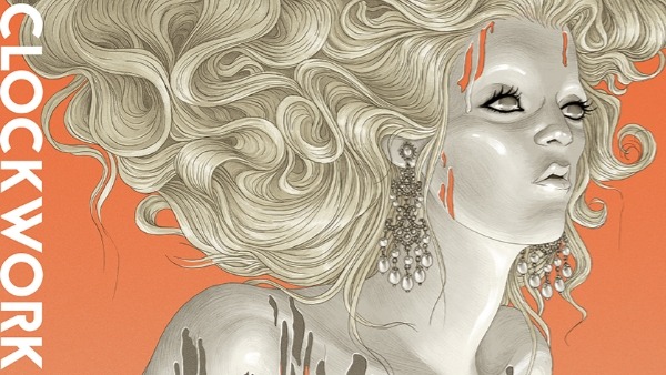
This Clockwork Orange was my first variant to date. Variants are hard for me because I normally conceive one design, and those are the colors. So it’s rare that I’m able to go backwards at the end and say “hey, let’s swap these colors, and those colors.”
With Clockwork, I shared with them my original idea, and while I had been architecting that concept, I had already been working towards an alternate version simultaneously. It’s A Clockwork Orange, and I wanted to put orange in there as a visual nod. But then again, the idea I was seeing in my head took place in The Korova Milk Bar, so it had a very dark, and shimmery feel to it. So when I started out, I told myself that I’m going to find a way to do both.
Click the images below to view the hi-rez version
A Clockwork Orange – regular print
A Clockwork Orange – variant
I told Mondo I only had two variants in mind; one was the Milk Bar, and the other was the original but done on on a reflective metallic paper. They had some concerns about what parts might print well and what might not on foil paper, so that was an idea I had to let go of. But then they came back with the idea of using a really great pearlescent paper with a shimmery finish to it, which was a perfect trade off.
I really trust their opinion on what they think will sell as far as variants go, and what type of variants will do better than others. Maybe some properties are maxed out at an edition of 350, where as other properties, like Marvel, they could offer an edition of 1,000 and people would still want more.
I would have loved to see the foil backing. But I imagine that would have been too light, and wash out the detail in the foreground, wouldn’t it?
Yes. That’s what it really came down to, the highlight. It would end up looking like a reverse negative because the lightest parts wouldn’t have any ink on it – it would just be the foil. But the foil, depending on the lighting, would look dark in which case you would have this sort of negative image instead of the bright highlights.
This piece is stunning, and it really grabs you in the same way that the film does. It’s visceral, raw, violent, and oddly beautiful. But what is refreshing is that there is no Malcolm McDowell on this. How did you get away with that?
[Laughs] That was something I really struggled with in the beginning. I kept trying to come up with an idea for Alex that didn’t feel like it had been done to death. Every image of A Clockwork Orange you find, whether it’s a book cover, or a DVD cover, or an alternative poster, all of them focus solely on Alex with his bowler hat, and his eyelash. So I was working through all these ideas and I was trying to find a way to make a portrait of him that looked fresh and new against all of the repetitive work that had been done.
I felt like I was attacking the problem wrong. So I decided to move into a different direction altogether. And leave the face out of it, which was a strong choice to make because we had Malcolm McDowell’s likeness rights for this. So when I pitched the guys over at Mondo and said, “hey I want to do this concept, but Malcolm isn’t in it. How do you guys feel about that?”, they cautiously agreed to move forward.
I think it creates a unique perspective on the film. I was never going to take a film like A Clockwork Orange and get the whole thing into one poster. It’s a high-concept movie with a lot going on, and most of it is inside Alex’s mind. I wanted to do something a bit more statuesque and iconic and just plain weird looking. [Laughs] You know what I mean?
The statue of the woman (who we’ve dubbed “The Milk Maiden”), figuratively, is a great representation of the film. Everything about the Milk Bar, the milk maidens, and the LSD-laced drinks just says a lot. It sets a tone that is sexual, bizarre, and violent looking for an appropriately sexual and bizarre film.
The following images are work Rory Kurtz has done for various clients/publications.
Click the images below to view the hi-rez version of each piece.
Voltron for Hero Complex Gallery & Dreamworks
Jack White for Rolling Stone Magazine
Florence & the Machine for Rolling Stone Magazine
David Bowie for Rolling Stone Magazine
American Horror Story for Entertainment Weekly
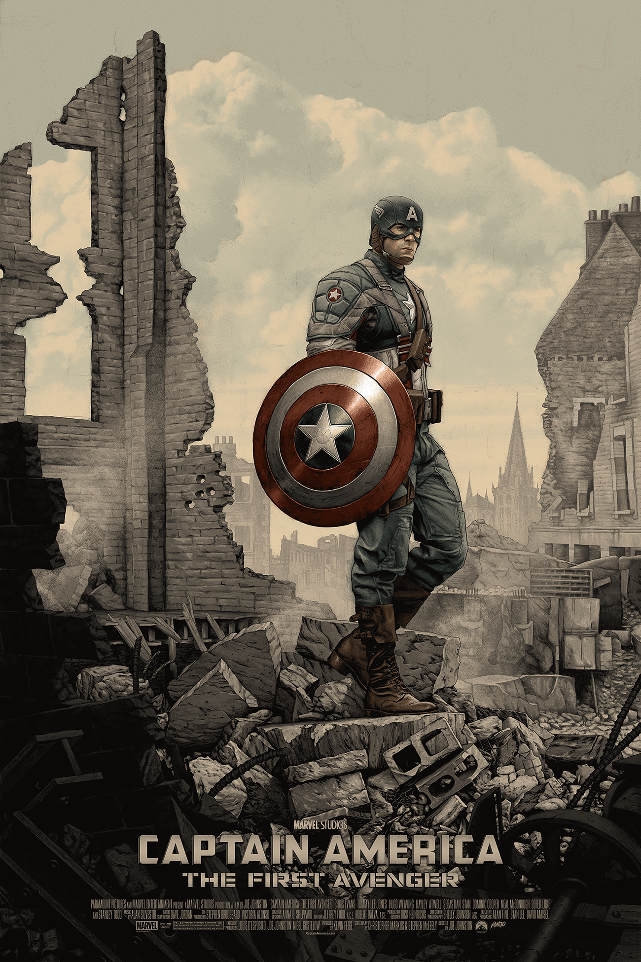
Let’s talk about your previous Mondo work. A Clockwork Orange is a departure from Captain America. But that is also removed from works in your portfolio that has these very vibrant, dreamlike compositions.
With Captain America, I had this idea of a World War II era photograph, a de-saturated war zone still photo of a hero after the battle has been waged, standing alone with his thoughts. With The Graduate, which just dropped, I had some more conceptual ideas I wanted to work with. Those revolved around Hoffman’s fear and growth through the course of the film.
I’m just a huge film fan. I have a bunch of prior Mondo posters from other artists frames up in the room I am working right now. In fact, my wife gifted me my first Mondo poster – Tomer Hanuka’s Melancholia. I have very strong opinions about film posters, especially if it’s based on a film I love, like Laurent Durieux’s art for The Dark Knight, or Killian Eng’s poster for Oblivion which just blew my mind. I’m also reminded of how a film is like a script with half the dialog removed from it – it’s a half finished conversation. You bring a lot to it with your perspective.
When you’re a kid, you might watch Flash Gordon, and you go, “this is the greatest movie in the world! I’ll never get sick of this!” Then you try and watch it at 30 and you go, “This is so ridiculous!” Well, the film hasn’t changed, you’ve changed. Your dialog has changed. But then someone else who’s 30 can watch it and go, “My God, it’s still as brilliant as the day it came out!”
So that being the case, this tells us that the individual has a unique reaction to the film and that reaction, a personal one, changes over time and is different from person to person. So there’s just no way a single poster is really going to work for everybody, and I recognize that when I’m crafting these posters. I try not to get too hung up wondering if enough people will like the work because these films mean different things to different people.
What talks to them about a film is different from what talks to me. So I just do the poster that I would want to hang on my wall, and hope that the people who have the same taste as me will go “yeah, I gotta have that!”
I don’t think I’ve seen your first Mondo project. What film were you commissioned for?
Back in February, I started working on a poster for a documentary titled, One Day Since Yesterday for the studio which Mondo was art directing. It was a chance to do something more ’70s inspired because the doc is about Peter Bogdanovich, who directed Paper Moon, The Last Picture Show, and so many others. We worked on that together and it was the first time I had done a screen print poster. I wanted to do all my own color separations, so there was a real learning curve there.
I’d also never worked at 24 x 36, so I had to come up with a whole new approach to tackle that medium, but still have it look like my work. I had to learn quite a bit but it’s part of this journey that I’m still on with the screen printing process to make the best poster I can.
To close this out, tell us about the kinds of films you like, and what has more or less defined your tastes.
I am a massive movie fan, and a nut when it comes to remembering directors and movie trivia. Films are very much a director’s medium and there’s not a lot that I don’t see. I’ve very big into sci-fi, like most Mondo artists I suspect. As a kid, I recognized good films even without understanding them. I remember watching Blade Runner on Channel 18 which is a local station. I couldn’t have been more than 6 or 7, and I couldn’t understand what the hell was happening on screen. I mean, it’s a pretty weird film to really wrap your head around even as an adult. As a 7 year old, it was all going over my head, but I realized that it was good and that there was something really good that you felt watching it. As I got older, I began to understand things in the film and it only got better.
I saw Tim Burton’s Batman when I was 10 years old, I totally lost my mind. It was Batman all day, everyday for about two years and Burton was my first introduction to a really auteur director and a director with a very heavy hand/style. It’s hard to mistake his films for anyone else’s, you know? Then I started picking up on other filmmakers with that kind of unique style, like David Fincher, or Ridley Scott. They just a have a personality that no other director could mimic.
But then I also have a great appreciation for a number of films I feel don’t get enough love. I love the real schlocky films from the ’80s and have a real soft spot for films like Ladyhawke, and John Boorman’s Excalibur, and other forgotten gems I wish Mondo would pick up on, [Laughs], but I just don’t think there’s enough interest out there. I have a nice little media room filled with all my geeky memorabilia and movie stuff which continues to grow.
Because of all this, I’m really grateful to be working with Mondo, and I hope that I can do more and more for them because I just love the format. It’s the kind art that I’ve always wanted to do because I’m such a movie fan and they’ve been very gracious to work with me to find properties that really fit.
Thanks to Rory for his time. If you’re heading to MondoCon this year, we hope you get to grab at least one of his posters! If you would like to see more of Rory’s work, head to his official website at rorykurtz.com
MondoCon 2016 will take place October 22nd and 23rd in Austin, TX at AFS Cinema and Holiday Inn Midtown Conference Center. An opening reception featuring artwork by Jason Edmiston & Ken Taylor will take place on Friday, October 21st at the Mondo Gallery. Follow MondoCon on their official page, or Twitter for additional updates.
 In advance of MondoCon 2016, we got to speak to poster artist Rory Kurtz about his recent work for the Mondo label this year. Kurtz, a self-proclaimed “massive movie fan” (and he proves it, too, diving into his wealth of movies knowledge during our discussion) has such a unique style, and that makes him a perfect fit for the brand. He has four posters released in this calendar year, and two MondoCon exclusive prints.
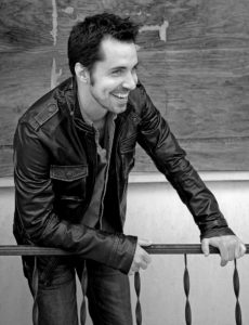
takes more time than is reasonable. So because of that, I hesitate to hand in any ideas that I wouldn’t be thrilled to paint.
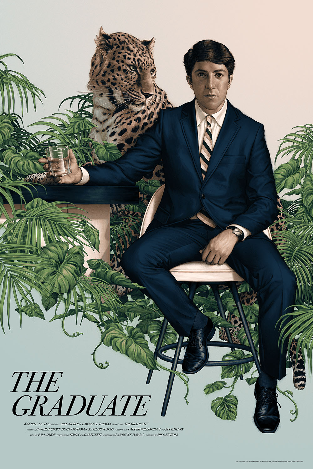
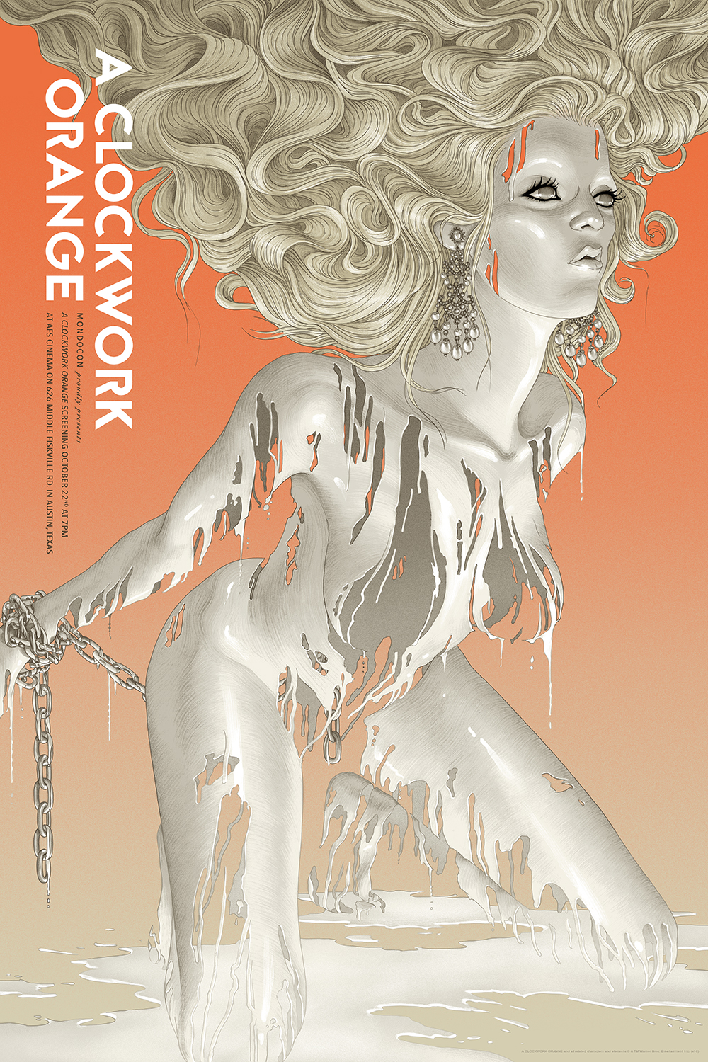
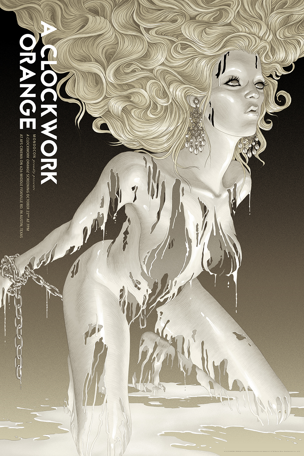
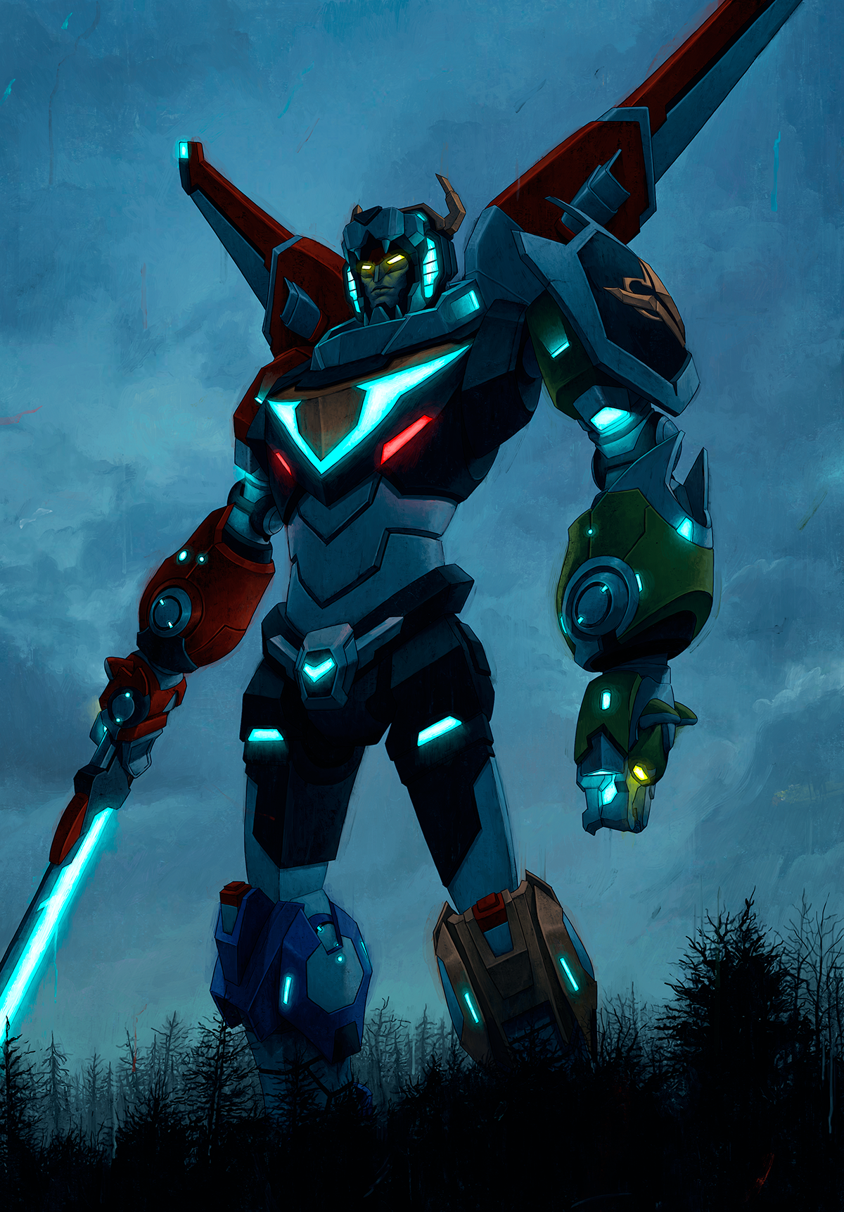
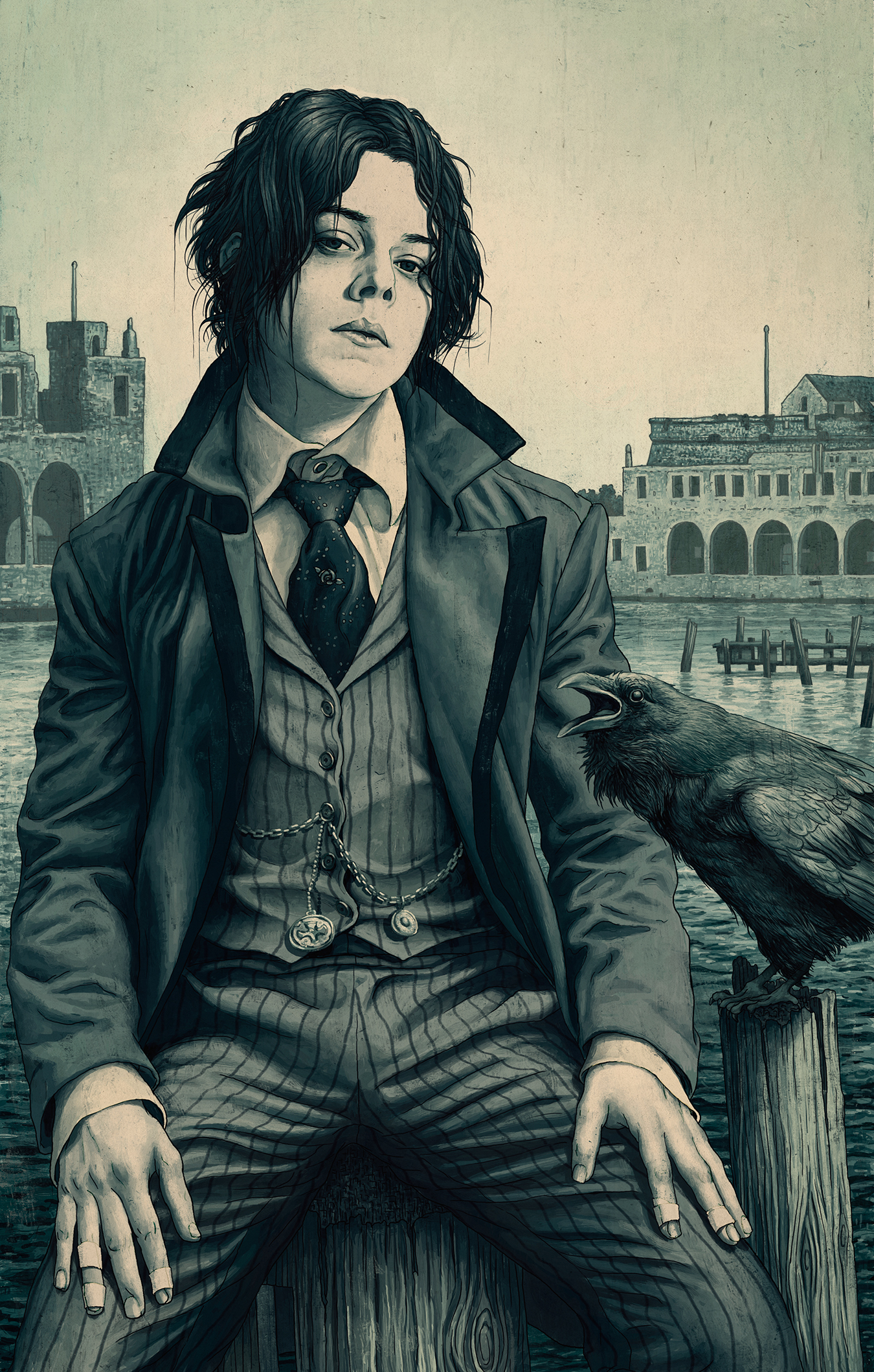
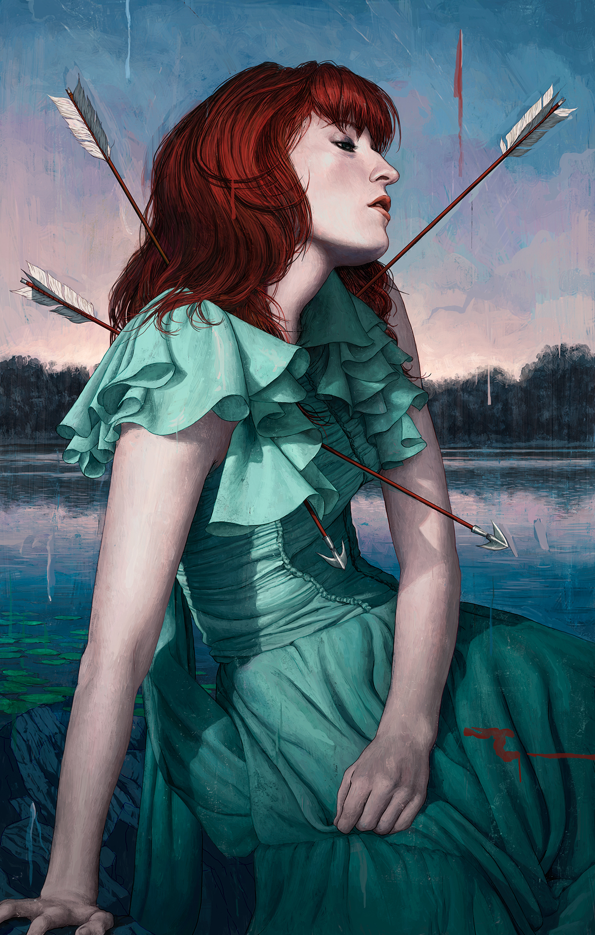
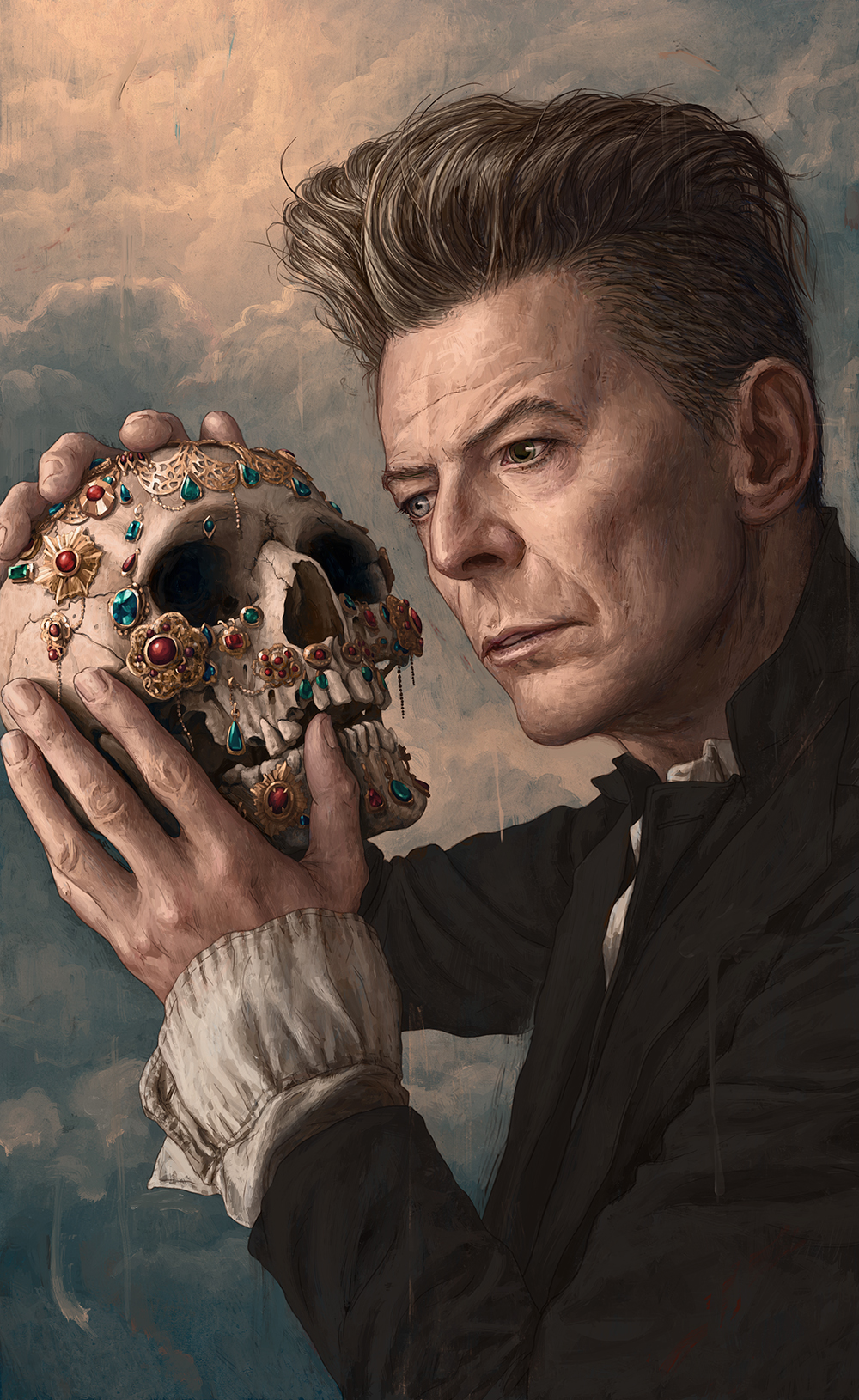
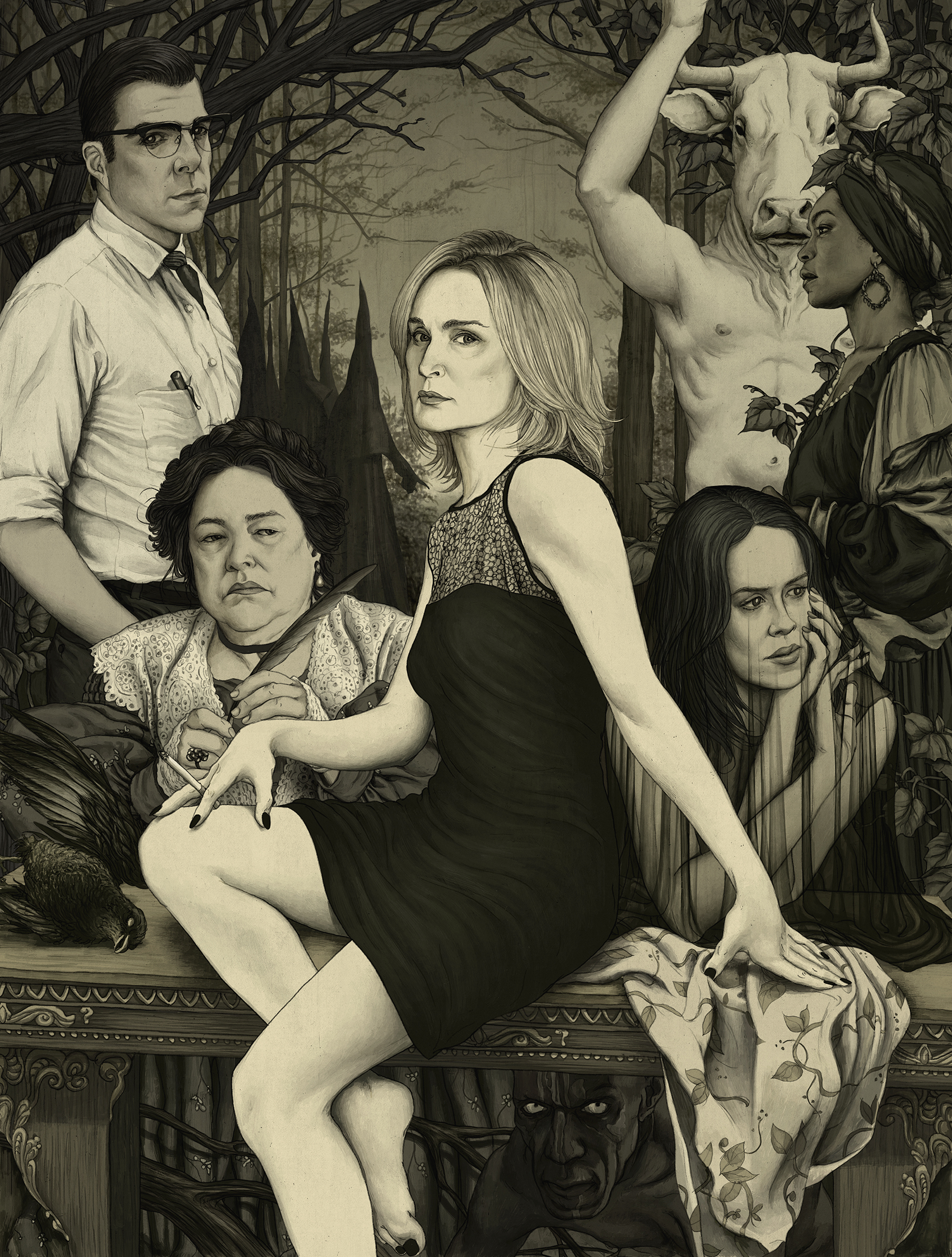
photo of a hero after the battle has been waged, standing alone with his thoughts. With The Graduate, which just dropped, I had some more conceptual ideas I wanted to work with. Those revolved around Hoffman’s fear and growth through the course of the film.