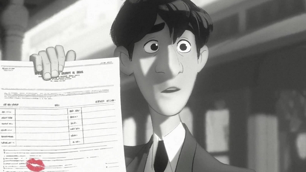
Editor’s Note: This interview was held following the animated short film sequence back in September at the 2102 Fantastic Fest. We held on to this to coincide with its screening ahead of Disney’s Wreck-It Ralph which opens Friday November 2nd.
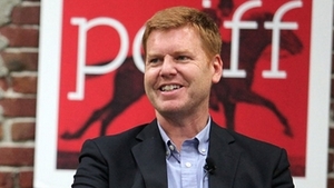
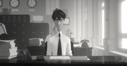
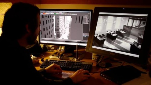
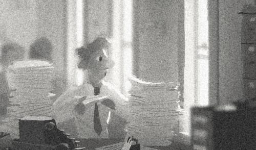
Part passion project, part experiment, Disney animator John Kahrs‘ short film Paperman is a wonderful combination of traditional 2D animation and CG. This hybrid style (achieved by creating CG animatics and then laying 2D drawings over those polygons) yields something that has the look of traditional hand drawn animation but moves with the fluidly of CG. Sounds simple but apparently it’s a lot of work.
However, looking at the end result, it has the potential to be a true revolution in the field of animation. You’ll have to see for yourself when the short plays before Wreck-It Ralph but for now, here’s what John Kahrs told us about his film when GoSeeTalk sat with this very experienced and visionary animator…
—————————————————————————————————————————————————————
– The short was fantastic, thanks for showing it. Aside from some still shots/production photos I knew very little about it and really didn’t expect to see this at, of all places, Fantastic Fest. But this, wow, this was one of the best shorts I’ve ever seen. The animation is just amazing.
Well thank you very much. It was like a blessing in disguise today as the screening because I didn’t expect to have to vamp in front of everyone for 10 minutes while we waited to get a new permission (the code to view it on-line had expired and they had renew it right before its start time in the session). It was nice to be able to explain some of this stuff to people who didn’t know much about it.
– On the surface it comes off like vintage Disney animation yet the hook is that it was created with a new animation style. So would you please talk about the inception, back story and how it got kick started?
It started many years ago so it’s a really old idea for me. The genesis of the idea came from when I was still an animator at Blue Sky Studios in New York, I was there from ’90 to ’97.
I was commuting back and forth and I would go through Grand Central Station everyday, and some times you’d cross paths with these strangers and you’d meet eyes with a cute girl and you wonder, “who was she? could we have a life together?” kind of thing, and then they’d be gone forever. So I always felt there was some kind of power to that electrical connection you feel when you meet people randomly like that. Then when you lose them there’s not much of a connection there but sometimes it feels like there could be and it got me thinking, what if two people were perfect for each other who made that random connection on a street or train platform, and what if they lost each other, how would they find their way back to each other again? And maybe how would the fates conspire to bring them together if they really tried hard enough.
I also like those canyon like spaces between the skyscrapers in New York and the idea of when you would throw a paper airplane out into that space how thrilling it was to see it out in the space between those buildings which was the visual hook. Those were some of the early ideas but when I was at Pixar for 10 years, I boarded it and cut it together as a short there but it really didn’t get fully green lit and turned into a real project until I came down to Disney. That’s that side of it.
The hybrid part where it’s 2D and CG mixing, that is the most recent phenomena. Working so closely with Glen Keane on Tangled and seeing how much drawing he did everyday and how much that drawing changed our work and how expressive those drawings were. They were everywhere and just so part of the DNA of the studio and it got me thinking, isn’t there a way to bring these drawings back into animation again? Why do we have to always leave them behind when we go into CG? Can’t we find a way to carry these drawings along with the CG?
I had these kind of ideas about how that would happen technologically. Ultimately it was the team I was working with that came up the process of how that was going to work and how the CG would drag these line elements along with it. It was a way that I never thought would be the way they would end up doing it but it was a brilliant breakthrough, the idea of dragging them on the pixel layer like that. (check out this video to see what John means by “dragging“)
– You know, I too am glad you did get a chance to talk about the technology because once you explained it I found mysef looking at the lines and how they moved like the girl’s hair on the train. In traditional animation hand drawn lines are cleaned up but there’s always a slight difference in the consistency of the lines. That’s just really neat to see one line moving and stretching.
Yeah it doesn’t “boil”, they call it boiling when it’s a different line that’s handmade each time it’s on a new frame, but what we’re doing is actually moving that one line in-tact through time and across the screen. That kind of stability that the line has is something you have to be careful with. If it’s too smooth it looks weird so we actually gave it a bit of that crawling texture and it kind of makes it feel more organic. But it was a lot of work, just figuring out the balance of texture and the tooth of the line so it helps tell people about what they’re seeing before they see because it really is a whole new way of animating.
– The muted/grey-scale palette helps set the story is a bold look, playing up those canyon like areas between the buildings you mention, but do you think that the contrast helps with the story better than some ultra saturated environment?
Well the black and white was something I wanted because I always had a great admiration for those old WPA photographers from the 30s and 40s, that depression era look, even Ansel Adams or how black and white photos have those great tonal ranges; rich blacks and brilliant whites. I really just love black and white film and something about New York in the early 50’s it felt like a nice match to have this be in black and white.
Now we’re trying to do a new project in full color and I think it was good we did this in back and white because it makes it feel like it’s from another time and really stylizes it. Now looking back at it I’m glad that we had only tone to worry about because if we had color in there it would have been much more difficult. We’re trying to do that now in color taking this technique to the next step.
– Your throwback style and hybrid animation reminds me of an element in the Disney CG film Bolt. One of the distinctive elements was that the backgrounds, in many traveling scenes, were given this Monet kind of painting style.
Yeah they did a really nice thing there where they were able to have those settings appear as if they were painted so when the camera rolled and turned the edges did’t distort no matter what angle you looked at it. It was a cool little trick they came up with. I think they actually backed off on the technique for the final product. But there have been a lot of attempts at taking something created by the expressiveness of the human hands on putting into a digital world, not just at Disney but all over the industry.
I just felt like we’re at a time where a lot of the CG films that are coming out right now all have kind of a similar target of this stylized photo realism that they’re working with and I really like the way those films look but there’s a part of me that believes that’s not the only way that animation can look. There’s something powerful about the hand-drawn line that can really communicate to people and tell a story. I think the tools are out there, so many sophisticated tools for compositing and animating everything that supports CG but you can kind of redirect them to do something that’s different and looks more like hand drawn so I’m not a purist about “hey I want to go back to 2D or I want to tun away from CG” or anything like that. I’m more just interested in how I can tell a story in a way that looks new and exciting.
Ultimately I think by the time you’re 2 or 3 minutes into Paperman, you shouldn’t be thinking about the technique, you should be thinking about is “is George going to get the girl or not?” and you want to feel something for this guy and the emotional connection and be immersed in the story and forget that it’s animation. Forget you’re in a theater, just be focused on the characters. If you can do that then you’ve won. That’s my highest standard of achievement. If you can get your audience to that state you’ve succeeded a lot. There’s a showmanship to the technique but it should always be secondary to the story.
– I hear that a lot from John Lasseter and Pete Docter a lot, the idea that you can have the zaniest characters, amazing visuals etc. but if the story isn’t there then it’s just not worth telling…
Yeah, the ultimate story telling where visuals don’t matter is like when you’re reading a book. Swiss Family Robinson or Lord of the Rings or something, you’re immersed in those stories because of what your own mind brings to it and what you imagine. You don’t need visuals at all because the stories are so powerful that they carry you through it.
– Lets talk future. If this technique were to take off and this were adopted then grew and expanded upon, how do you see the man power breakdown in how this relates to straight 2D vs CG?
It’s a little bit of a lopsided thing where you’re using less modelers but using more animators in other departments. But Paperman was just the first stab at it so we don’t have any economies of scale and we haven’t found our efficiencies yet so I am going to let the producers worry about if it is less or more. I mean I’m very conscious of cost control and I think it’s good to be and I don’t want to dwell on it too much but you have to be conscious if you’re going to make a sustainable form of entertainment that’s going to last. *laughs* but yeah if it were cheaper it would be awesome and there would be a lot of interest in it so it’s as simple as that.
– Well I was asking because when you watch these movies, sometimes the perception is “oh it’s CG, it’s all on a computer, that’s easy right?” when it’s really hundreds of animators putting in thousands of hours and then its a similar case with hand drawn too. So forgive me for asking questions about something that hasn’t been established but I’m curious about what kind of cost savings or ease of use might help propel this to be a new standard.
Well from what we know, it costs about the same really. It’s comparable so far but we don’t really know what the future is but the bottom line is that real quality craftsmanship, whether its building wooden boats or you drawing great animation, or the best scotch, or great watches, it’s always going to be expensive because it takes a lot of care and attention to make all of those details right. And that’s the place I want to be though, in that craftsmanship spot. I’ve always felt comfortable in that.
– Now with the change in audiences over the years, those who grew up watching Disney’s Snow White and then Pixar’s Toy Story, they accept the changes to the point that makes other studios scramble to emulate the look and have a similar “hook”. So for this to come along and not be some CG rabbit but something that feels vintage would this be enough of a game-changing hook to show something people have never seen before?
There has been the idea that there’s the spectacle behind the newness of CG but we’re only at the first steps where a movie like Brave or Rango. The refinement of the way those things look is just unbelievable. They look so real so detailed and tangible like you could reach out and touch them. Very well executed. Particularly the water in Rango was just unbelievable. It was like a visual feast, but I think there’s going to be another wave that’s going to come that’s going to dig even deeper into the storytelling and they’ll use these tools to push even more and I love that idea. But I think what I’m doing, maybe this is just a one-off, or maybe it can emerge into a whole set of new kind of animation.
But I think right now, it works as a short and we finished by the skin of our teeth, and we’re trying to test it more and push on it more so I’m excited about the future. There’s potential there for something really really cool. If you think of a John Singer Sargent painting, he’s one of those great artists who has a great brush stroke and texture to his paintings. If you can imagine that but it’s moving. That I think would be really cool to see done really well. Or there’s all these different kinds of styles that you see.
For instance, Hayao Miyazaki, you can see him playing with different styles from one film to another, the texture and the kind of way his films look like in Ponyo vs Princess Mononoke. But even within Princess Mononoke he has these cool cross-hatched characters, those guerrillas or apes. So there’s a lot of potential for really cool things that we haven’t seen before that could leverage the technology to make something amazing. *laughs* You’re getting me all Crusade style, like “yeah, and furthermore, we’re gonna take over the world”*laughs*
– No, by all means, lead the way John. But I’d like to get a time-lapse view of your journey. As an audience member we see the finished product but what we see is never exactly how it was imagined when the project was started. So tell me, how did it change from when it started to how it finished?
Not that much, pretty much what you see is what I envisioned. One thing that changed along the way was the idea that it was going to be all flat tones. No gradations, just one flat tone, next to another flat tone, but actually the whole thing is full of gradations all over the place. I think, from the beginning, we were just feeling in the dark. When we got going, I had this idea of a drawing that was moving out there in 3D space and I think we reached that destination but we did it in a way visually that I never predicted and I think a lot of it has to do with art director Jeff Turley who is this guy who was just a trainee a few years ago, who is a brilliant young artist . He was just like “I got it, I got it” and just ran with the idea. He had such good taste and ideas of how to handle all those details, and the edges of things, how rough or soft or crunchy or crumbly the line can be and he helped a lot.
– The look of the film, very retro-styled, takes us back to simpler times in animation, even films. It’s refreshing because it’s engaging but doesn’t have to be 3D like lots of what’s out there today, or in your face and visceral to get the point across.
Well I have my tastes and for one thing, everything old is new again, like Paperman itself, so I think there’s a lot of value looking back. If you think of the paintings from the old war posters, or LIFE magazine illustrations and those from the 40’s and 50’s, those guys could paint man! So you look at that stuff and go “I like that, that’s appealing” and I think that’s something you can bring back into visual storytelling again. You can bring that back in a way that’s new and you don’t have to be precious about the way 2D animation was. You can push it into the future and let it become something new again, so I feel it’s OK to push that way.
But in terms of filmmaking, and the whiz-bang, cameras flying around everything, well, I’m a big David Lean fan, The Bridge On the River Kwai, Lawrence of Arabia, and I like Kubrick a lot too. They’re very deliberate about where the camera is going and where it sits and when it’s there, it’s not moving. He picks his shots very carefully and he composes them very carefully and the storytelling happens within the frame and when the camera does move, man you feel like, ok, it’s moving for a reason and you’re taken on this journey because the camera is moving.
So you see that in Papaerman, the camera stays put for a while and then when it moves, something is happening. That’s partly my taste and I think in the fullness of time hopefully the films where the camera is moving wildly all over the place, that’s a cool style and it’s fun to be in those movies that are like that but films can be quieter and take their time and there can be patience and care and attention to where the camera is and what it does….I’m getting all snobby now.
– No that’s perfect, I can’t follow that with a good question. So let’s have have little fun with this last one. Give me your “go-to” animated films. What really impresses you?
You can see it a lot of echoes of it in Paperman, but The Sorcerer’s Apprentice sequence in Fantasia, that idea that music is driving the motion of animation together in time. Also I think Bambi is great one. I’m not really an animation nerd or go out of my way to watch animation, but I grew up watching Disney and so when I started working at Pixar I said, “I have to do my homework” and started digging into these again and Bambi is jut, like wow! The way the backgrounds are handled, the sense of space, and mood, the delicacy of the animation, the sense of light, it just keeps on giving and giving. I think it’s an amazing little movie, it’s only about 70 minutes long and there’s a perfection to that.
I’ve been watching Nausicaä a lot again and Miyazai films are unbelievable. Wallace & Gromit are pretty tight and I’ve been watching a lot of Spielberg again too lately especially E.T. Not that much animation specifically these days but those are my favorites. Oh, Song of the South! That’s unbelievable. It’s hard to find but the Brer Rabbit and Brer Fox characters are, in a way, at their peak there. I came back to Disney features again only within the last 10 years and I’m really appreciating what an accomplishment they were for their time and if you think of the first 5, Snow White, Pinocchio, Fantasia, Bambi, Dumbo, you see just how bold and risky Walt was trying all these new things, I’d like to push in that way and try things as exciting and dynamic as what he was doing at the beginning, those first 10-15 years or so.
Thanks very much to John Kahrs for his time and to Disney for arranging the interview. Paperman and Wreck-It Ralph open in theaters across the country in Disney 3D and Digital 3D starting November 2nd.
