This goes out to all you Go,See,Talk fans out there…
I have been wanting to make improvements to the site for some time now and while I would like to say change is right around the corner, that would be a lie. Truth is, I have all these ideas about what I want to do and very little time to accomplish it. So why am I telling you about what I’ve yet to complete? Well it is because I have been working on executing some of my “grand design”. First off, I have created the logo for the site. Have a look and let me know what you think:

Like that? Well, here’s some more good news. In the next week or so (but August at the latest), I will be unveiling a new type of post which we’re calling FourScore. In each post, which mathematically will be happening every 2 weeks we’ll have a sort of “battle royale” pitting 4 film scores against one another and trying to determine the superior effort. Each FourScore will have a distinct theme to tie the movie together but you’ll just have to stop by and see what it is:)
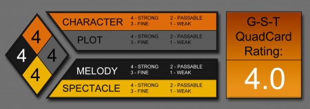
Next up, we’ll be changing the way we evaluate a film…again. Previously, we had the Premise/Highs/Lows approach, but it felt a little too elementary. Next we decided we’d just let the review run wild with no beginning or end, just our thoughts all laid out…but that was too un-structured. So we’ve come up with a new way to try it. It breaks the movie down into 4 categories (PLOT, CHARACTER, MELODY, SPECTACLE) which are taken from Aristotle’s writing on dramatic theory.
We’re calling it QuadCard. Everything will still be graded on a 1 to 4 scale and the 4 categories will contribute to an overall cohesive “report card” score if you will. So you don’t even have to read our reviews (we don’t blame you, as I do ramble), just check out the graphic and see what we think. Will it work? Who knows, but like Al Bundy once said, “Let’s throw it in bed with Madonna and see if she sleeps with it“. Stranger things have worked in the past. Have a look…

Finally, and this will be an interesting direction for the site, we’re going to have two new categories:
- At indeterminate times you’ll see something called “Thoughts from the Misses“. That’s where you’ll get to hear from Mrs. Go,See,Talk (read my wife) and her thoughts on a movie we saw, something on TV or whatever she feels like. Most likely it will encompass the woman friendly properties out there like Twilight, chick flicks and anything having to do with Sarah Jessica Parker:P
- Next, we’re doing something called “Ultimate 80’s” and we’ll feature a post about something nostalgic that defined the 80’s and became icons for future movie viewers. We’ll highlight heroes, villains, creatures, cars, etc. If it happened while I was growing up and it was cool, we’ll write about it.
Our Polls will be going away but I don’t think we’ll really miss them…plus Aiden does polls better and Ross V Ross does match-ups (like our Which One Are You? polls) better than us:)
Yet for all that’s mentioned above, the things that we still feel are a long way off are a complete site redesign, and (should we have the time and capabilities) our very own podcast. But, as they are more lofty, and we still don’t know what the hell we’re doing with the content we have now, that will still be a ways out. (If any kind-hearted G-S-T reader feels like they want to send us an email telling us how to get started, cheaply, we’d be eager to receive it!!)
So that’s the way we’re gonna play it. If it works then the efforts were worth it…if not, then like Thomas Edison in his search to create the light bulb, we will have found a few more ways how not to make a successful movie site.
More to come, oh yes, more to come!


20 Comments
jiayu
the new logo is cool. it has the whole Go See Talk vibe… i just came to this site for about 5 weeks (?) so i think i’ve been reading your second stage of reviewing, which has great content, but i’m looking forward to your Quadcard. i’m never lived through the 80s but it’ll be good to read about why it’s got so much clout today. and of course it’ll very interesting to hear what female perspective the ‘Misses’ has to offer. just wanted to say… love the site.
Marc
Thanks Jiayu, glad to see you’re liking, er, “love the site”. That really makes me happy. Please come back anytime!!
We’re excited about the changes. They may be lofty but if we start small, I’m sure we’ll get there one day:)
Castor
Love the logo, and all the new ideas so far. Looking forward to those awesome changes especially QuadCard which sounds like great fodder for discussion.
Marc
Thanks Castor. We’re excited too, but like I wrote, baby steps…
rtm
Hello Marc, I like the logo and you definitely got some great ideas going here. The QuadCard is a great way to organize reviews, I know I’m guilty of going on and on sometimes, and I don’t even have a rating for them yet. Like Castor said, it’ll fuel some good discussions which is always a good thing.
Oh, and looking forward to your Ultimate 80s post, I’m sure there’ll be some fun guilty pleasures in there 🙂
Kaiderman
Yeah… the logo is awesome… simple but very specific. Good on that front.
Love the Aristotle stuff. Some of the other stuff confused me but I’ll check back and figure it out.
I can’t help with site stuff but if you need podcast info, I just went thru all that and did it cheap.
Marc
Thanks Kai, we maybe in a side-bar after our podcast you can give me the low down. I do better listening than reading anyway so any efforts to explain in an email would be wasted:P
Kaiderman
Yeah… we can do that!
mcarteratthemovies
What’s all this business about me being to cool for YOUR blogroll?!? Look at you, with all these fancy new whatchamawhoozits and pics and whatnot!
I do like the new logo — very graphic designer-y.
Castor
Meredith is too cool for us now. She is part of a different crowd 🙁
Heather
Meredith has always been cool, but never too cool for us.
Marc
Well when you don’t have anything close to the substance of BEST BLOG WINNER M.Carter, you make up for what’s lacking with flash;)
Hey, it’s been working so far and 5 mins with Photoshop can get you anywhere:P
Heather
The LOGO is awesome and all I can say is………..you’ve made me feel very unambitious for my lack of doing anything this past month. Bravo and keep up the stellar awesomeness.
Marc
We shall try, but the Mobsters are a tough act to follow;) Thanks for your kind words Heather!
Peter Eramo Jr.
The new logo looks great! Perhaps an idea would be something to use for the “See” portion of it — like you have the cloud to symbolize the talking aspect. Anything you can use for the “See”? Hmmmm….QuadCard sounds terrific. Looking forward to seeing it all. Now get on it!!! 🙂
Marc
Well SEE is supposed to look like its being projected on a screen. I thought the 3 seats in front of it were prominent enough to make that clear. Let me work on it a bit more:) Thanks for the input!
Jessica
The logo looks great Marc and I like the new ideas. Particularly having your lady give a girls perspective. Maybe you can do a he says/she says thing. Good job!
mill1924
I’m totally digging the new logo. That will be a great improvement and like Castor said above, the quad will be great for discussion.
Dreher Bear (...Where The Buffalo Roam)
Sounds pretty sweet! Looking forward to reading your new future content :). By the way, I also like the new logo!
Marc
Thanks for the enthusiasm. It’s coming, just a little slow to start that’s all:P